
CMYK vs RGB: why your colours shift on press
That electric blue on your screen might come back a shade duller. It is not a mistake — it is the difference between light and ink. Here is how to stay in control of it.
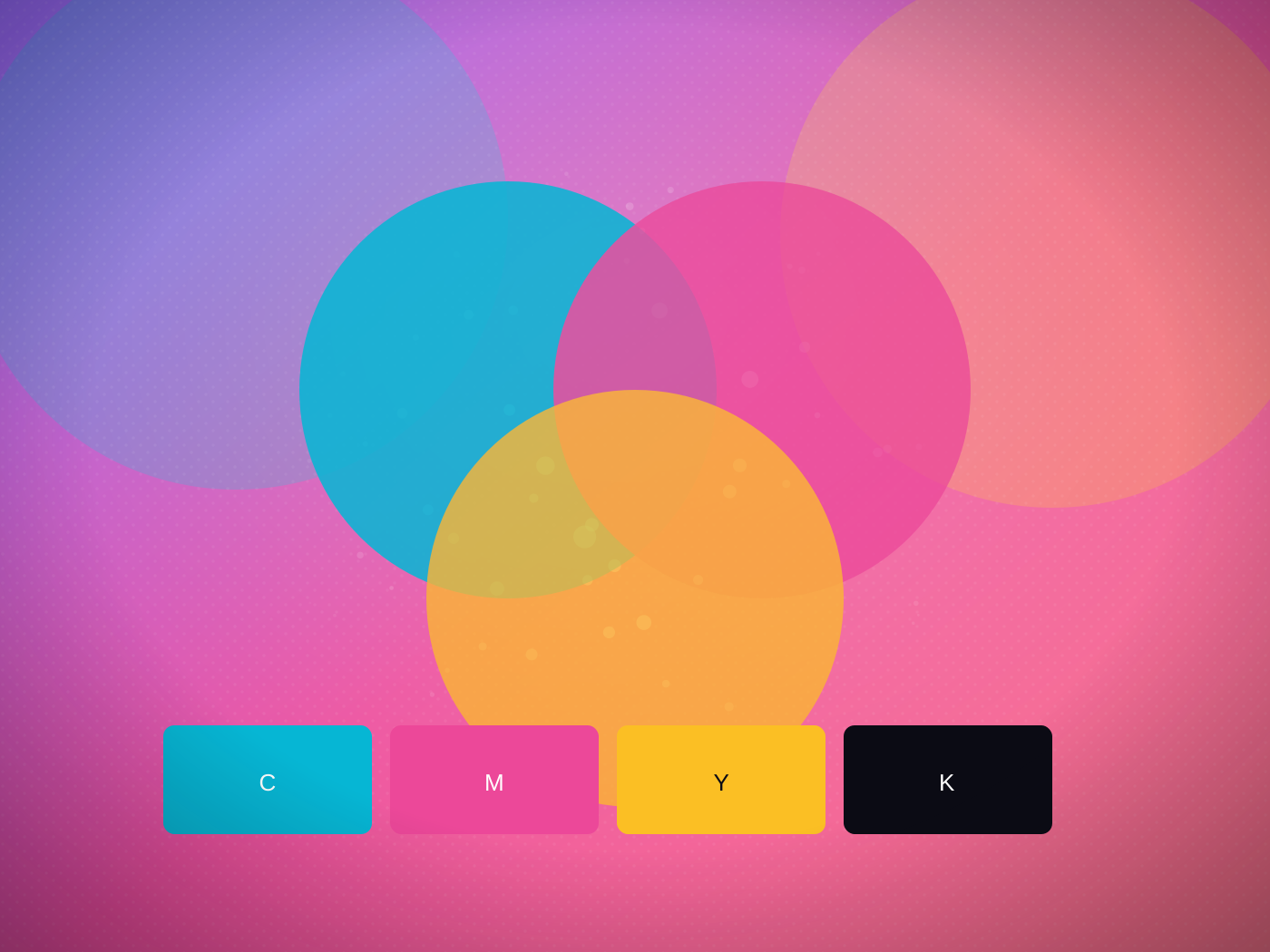
A screen makes colour with light — red, green and blue, mixed bright. Print makes colour with ink — cyan, magenta, yellow and black, laid on paper. The two gamuts do not overlap perfectly, and the gap is where surprises live.
What shifts, and why
The most vivid RGB colours — electric blues, neon greens, hot oranges — sit outside what four inks can reproduce. Converted to CMYK, they land at the nearest printable colour, which is usually a touch less saturated. Muted and mid-tone colours barely move at all.
How to keep control
Design in CMYK from the start, so your screen is already previewing printable colour. For a colour that has to be exact — a brand blue, a corporate red — give us the Pantone reference, and we can match to it rather than approximate.
The one to watch
Rich black. A black built only from the K ink can look flat on large areas; a "rich black" with a little cyan, magenta and yellow underneath prints deeper. For big solid backgrounds, ask us for our rich-black recipe.
When it matters, we can run a printed proof so you approve the real colour on the real stock before the full run — no guessing from a screen.
Not sure what yours needs?
Bring it to any counter. Two minutes with a craftsperson beats any amount of reading — including us telling you it is not worth the money.